
Mother earth
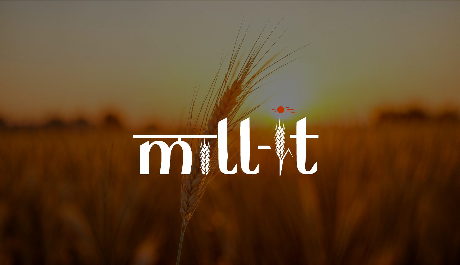
The letter m is shaped by the Hindi form “म” (maa), a nod to Indian roots, mother earth and the tradition behind the grain.

[ Case study · Organic food & wellness ]
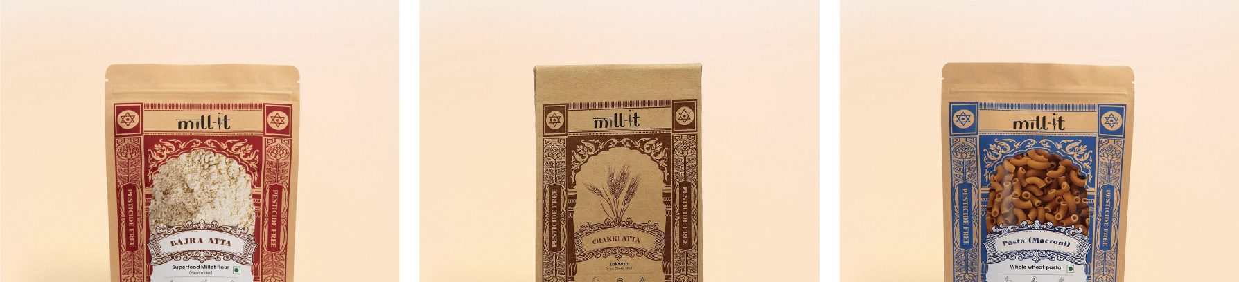
A premium organic lifestyle brand, built to bring the purity of nature back to the modern table.
Brand strategy · Identity · Packaging
[ The brief ]
Mill-it needed a complete brand language that would honour traditional milling while meeting the expectations of a contemporary wellness audience.
[ Brand personality ]
The brand sits at the meeting point of ancient wisdom and modern wellbeing: warm, transparent and unmistakably rooted in the grain-to-table journey.
[ Building the mark ]
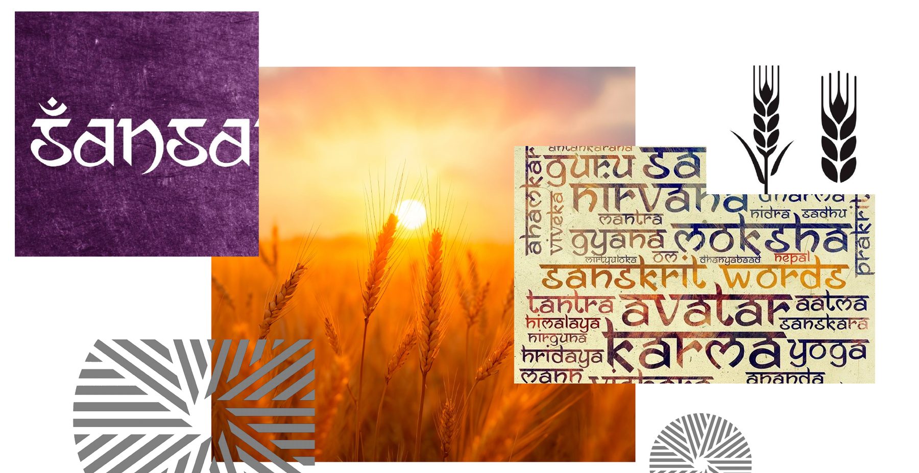
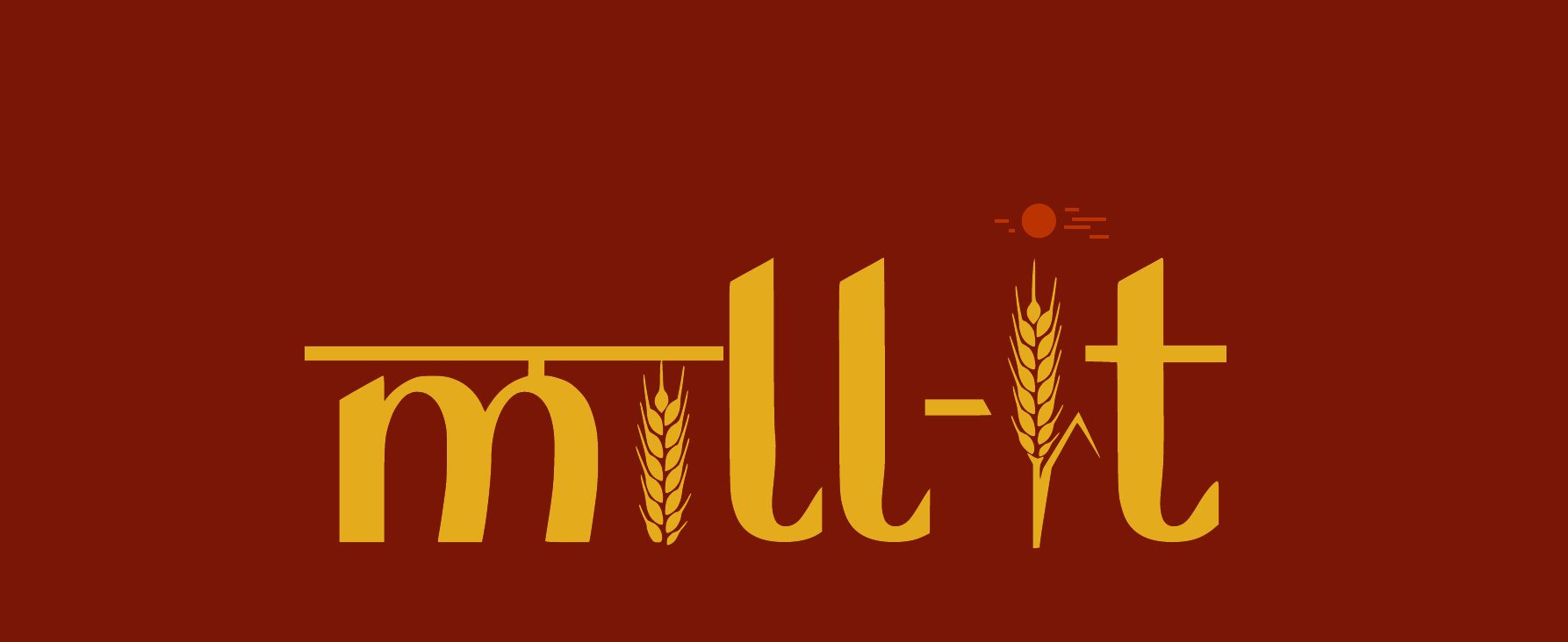
The letter m is shaped by the Hindi form “म” (maa), a nod to Indian roots, mother earth and the tradition behind the grain.
The red dot signals energy, growth and the natural cycle that nurtures every crop.
The i becomes a stalk of wheat: a direct cue to farming, grains and Mill-it’s core ingredient story.
[ Colour palette ]
[ Next ]